
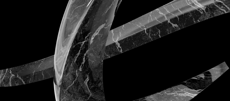
It's not just a 2-D mark, but rather a full-on 3-D sculpture. But it's kinda hideous and overwrought, right?
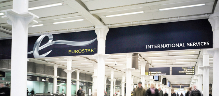
Eurostar, the high-speed train between London and mainland Europe, has unveiled a dynamic new branding scheme designed to capture its bursting ambitions as it barrels full-speed ahead toward dominating European rail. 

"This re-brand was about creating symbols of change, not a change of symbol. ... [W]e don’t think Logo’s [sic] do enough to help products, services and organisations differentiate, communicate and adapt in the modern world. So we created a multitude of ways Eurostar can create exiting experiences for their customers and staff, everything is adaptive, everything points towards Eurostar’s design-led point of view."

[The branding scheme includes pictograms for train interiors, which will be designed by Pininfarina]
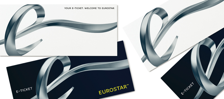
[Different materials will connote different passenger classes] Which sounds great and all, but to judge by the images, we don't see tons of adaptability, beyond assorted surface treatments on the "e" to point up different passenger classes (how British). And while the "e" probably works great in 3-D -- as Creative Review writes, "A giant sculpture, perhaps wrapped by some famous artist, would no doubt look spectacular at the entrance to Gare-du-Nord or St Pancras" -- we worry that it's too much look for other media. On something like letterhead, it would just chew the scenery.
Recall that some of the best dynamic logos of recent memory, like PWC and Comedy Central, succeeded because they eschewed complexity in favor of simple forms that play just as well online as in print. We can't say the same about Eurostar. But frankly, it's too soon to judge -- SomeOne still has a year working with the train operator to deliver on the new concept. Here's to hoping it travels farther than we can imagine.

http://www.fastcodesign.com/1663510/eurostars-swoopy-3-d-logo-reflects-big-ambitions-and-kinda-fails
You have read this article design
with the title Eurostar's Swoopy, 3-D Logo Reflects Big Ambitions (and Kinda Fails). You can bookmark this page URL http://emill-emil.blogspot.com/2011/03/eurostar-swoopy-3-d-logo-reflects-big.html. Thanks!


